
Wednesday, 20 November 2013

Friday, 8 November 2013

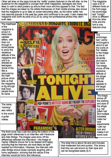
Monday, 21 October 2013

Sunday, 20 October 2013
Feature Article Artist Planning
I have chosen to do a band rather than a solo artist, containing one man and two women. I decided on this because I feel that it doesn't occur very often to have that ratio and is often the other way round, featuring two men and one woman, who is often the lead singer. (Examples of this are: Paramore, Chvrches, London Grammar, Braids, Kate Boy etc).
Profile 1:
Name: Marshall
Age: 22
Place in band: Lead singer, bass player, and pianist.
Marshall is a mysterious, vain character who prefers to do
things for himself and his bandmates over anyone else. Despite being the way he
is, he is shown to be very close and caring with his friends. He dislikes the fan community part of being in the band and is only in it for his friends and the music. Although he is seen to be quite serious, he is also sarcastic and has a good sense of humour. He met Kira a few years ago, while Callie is actually his older sister.
Profile 2:
Name: Calliope; Callie
Age: 22
Place in band: Guitarist, backing vocals.
Callie is a kind person and is most interactive with fans.
She’s bubbly and enthusiastic, spends a lot of time updating her social media (such as Twitter, Facebook etc) and cares a lot for her bandmates. She met Kira through her brother Marshall's friendship with her. She enjoys being in the band and is the most outgoing of all three; often speaking for the band instead of Marshall, who, as lead singer/song-writer, is thought to have been.
Profile 3:
Name: Kira
Age: 20
Place in band: drummer, guitarist
Kira is moody and sarcastic and likes to avoid talking to
most in person. She finds her fans amusing with their dedication and often engages with
them via social media such as Twitter. She is known to be very close with Callie and Marshall, but is seen to be quite talkative with other bands. Kira is shown to have a strong dedication to music, having put up covers of songs on the internet.
The band is doing an interview because of the release of their second album, Apocalypse Arisen, which they are promoting by doing a UK tour. In the interview they will discuss the upcoming tour, the album - things like what inspired them to make such an experimental album and the symbolism behind some of the songs, talking about any future releases,
The band is doing an interview because of the release of their second album, Apocalypse Arisen, which they are promoting by doing a UK tour. In the interview they will discuss the upcoming tour, the album - things like what inspired them to make such an experimental album and the symbolism behind some of the songs, talking about any future releases,
The appearance and look of the band will vary for each member.
Marshall has short blonde hair and keeps his eyes covered by sunglasses the majority of the time when out in public, and wears dark jeans, dark shirt and dark vest over the top. His outfit has to be dark to contrast with Callie’s light outfit. Callie has mid length/short coloured hair –possibly light pink or blue – and most often wears white/light coloured dresses, in order to contrast with Marshall’s dark outfit. Kira has long dark brown/black hair and wears more coloured clothing than Callie and Marshall, usually wearing jeans rather an skirt or a dress like Callie, to contrast with the other two. Make up will vary for each of them; Marshall will have his face covered by his sunglasses, but other than that, his face will be kept plain. Callie will have more colourful makeup, while Kira will simply have red lips and dark eyes.
Marshall has short blonde hair and keeps his eyes covered by sunglasses the majority of the time when out in public, and wears dark jeans, dark shirt and dark vest over the top. His outfit has to be dark to contrast with Callie’s light outfit. Callie has mid length/short coloured hair –possibly light pink or blue – and most often wears white/light coloured dresses, in order to contrast with Marshall’s dark outfit. Kira has long dark brown/black hair and wears more coloured clothing than Callie and Marshall, usually wearing jeans rather an skirt or a dress like Callie, to contrast with the other two. Make up will vary for each of them; Marshall will have his face covered by his sunglasses, but other than that, his face will be kept plain. Callie will have more colourful makeup, while Kira will simply have red lips and dark eyes.
Location for the shoot will take place in a secluded area,
most likely outside by a wall. I want it to be in a more open aired space to show them off in their surroundings. The props that will be used will
consist of 3 torches to shine under their chins to give them a spooky look,
linking back to the genre of alternative. Each will have individual shots. There will be one or more group photos; one being of them with
the torches, positioned with Marshall in front, Kira on the left and Callie on the
right.

Sunday, 13 October 2013
Contents Page Analysis #2: Kerrang!

- The purpose of a contents page is to inform the reader: while the front cover gives some indication to whats inside the magazine, the contents page offers more information and is there to help the reader find a specific page that they might have been looking for from seeing on the front cover.
- The contents page mentions 17 artists and more included in those articles.

- Contents logo: shows humour in the magazine. By making this silly remark it makes the magazine seem more friendly to the reader, as well as showing off that the target audience is a young audience, as magazines aimed at older audiences wouldn't make such a childlike observation.

- Hello Readers: The contents page includes a small paragraph from the editor of the magazine, sharing his opinion on the cover story band. This paragraph adds to the overall friendliness of the magazine, as well as making a more intimate connection with the reader.

- Instead of making the main image of the cover story band, Kerrang! chose to use an image of another band Paramore, who was featured on the front page in the corner. Paramore is often mentioned in the magazine across the issues, showing that they are widely popular with the Kerrang! readers. The fact that they used an image of them instead of the main band is enough evidence.

- On the contents page, they include a small sentence or two about the article. This is often written in a jokey style, making the overall magazine seem informal. This makes us, the reader, want to read more, as articles written with a jokey attitude or articles that are dramatic/life changing are often more interesting than those which just feebly express their opinion about a new album.


- The contents page 3 main images (not including the image used for the editor's message). The first image of Paramore is rather questionable, seeing as they're in a boat riding a sea of balloons. The boat is enough for you to theorise the story behind it, which makes you want to read the article to find out if you're actually right about it or not. The other images are more simple, but include images of the respective bands and that is enough to draw the reader in.
Music Magazine Initial Ideas + Final Idea


Sunday, 6 October 2013

Thursday, 19 September 2013
Analysis of a Music Magazine Cover

- Age: The age range of this magazine looks to be directed towards an adult audience, starting from about 19 – 29. The sophistication of the magazine and hint of something a bit younger directs it towards any music lover.
- Gender: The fact that only one female artist has been mentioned on the page shows that it is maybe a more male-based magazine, possibly a ratio of 3:1 with men and women in the music industry. However, the audience is more likely to be made up of females, as the majority are attracted to male artists. There is no doubt about the male audience being involved, but it looks like it’s closer to 60:40 on the female/male ratio.
- Personality: The personality of the audience shows that they are interested in new music. This magazine often shows off big stars, which in return promotes their music and guides the reader into their music genre. The audience is more likely to be open to different genres then solely one or two.
- The layout of the magazine shows everything is very formatted and straight, showing that it’s a more adult magazine. The only thing that throws off this image is the ‘punk pig out’ section in the top right corner, which directs the magazine towards possibly younger and more rebellious people. This detail allows the magazine to show how much variety the magazine has in terms of music, from the more sophisticated looking Muse on the front of the magazine to the punk-looking Lydon and Strummer in the top corner.

- Strap line ‘punk pig out’: suggests punk audience
- Strap line made to look like ripped paper – suggests rock, rebellion and against the rules
- Text used on strap is all different, suggests variety of genres mixed into one - that being punk
- Has red behind the words making it seem more ‘dangerous’ which suggests metal and rock music as well.

- Advertises other bands: offers promotions for other bands – already known, not new bands – suggests loyalty to music instead of only looking for new music
- Other bands section: Cat Power – pun – connects with audience who own a cat, who like cats etc. the pun suggests Cat Power is bringing out new music or ‘kittens’

- Advertising new albums on sale: gives reviews of albums, guides readers into their opinion to keep their community united as one with more similar interests
- This shows us the other sorts of music that this magazine includes; looking at the artist names, I can tell that it’s a large variety. The variety of different music genres suggests that the magazine interviews the bigger stars instead of aiming it at a particular music audience. Instead of interviewing and reviewing only artists in their genre, they interview tons of different artists from different genres who have recently gotten big. This means they have a much wider audience as it will include many fans from different genres.

- Picture: Matt – eye contact with reader, suggests connection between reader and artist
- Picture: Dom & Chris – on either side of Matt (lead singer, head of band) looking off into space, suggests unity
- Body language: Matt’s body language shows off that he is superior. The angle of the camera is tilted upwards at him to make him look down on us, making us inferior to him. This ties in with the religious nature of music in which fans will often have musicians or bands as their gods; Matt Bellamy is a prime example of this.
- Background: links in with theme on the artist – space. This suggests that the music they produce is very different and individual from other music, shown by the space background showing them as ‘out of this world’. This tells us that the genre of music may be something similar to alternative, possibly mixed with rock.
- Q: Puff reading ‘The world’s greatest music magazine’ shows that it is a well-known magazine doesn’t even need to show the entire puff for people to know.
- Shows that the magazine often gets to interview big names such as Muse, Lady Gaga etc.

- To do with their biggest ‘challenge’ yet, suggests new music with a different style than their music before
- References Star Trek: “Boldly go where no band has gone before” and space theme
- Exclusive interview: makes the reader feel like they are important enough to read it and that they are one of the first and only.
Sunday, 15 September 2013


Readership Profile
Age range: Seeing as my problem page will be aimed at those
in Sixth Form, the target age will range from 16 to 18-year olds. It’ll cover
issues such as relieving exam stress, how to revise properly and will include
more personal issues such as home life, out of school activities and friend
problems, as these are also important to being a healthy, happy student. With
the larger range of subjects that will be covered, it will gain a wider
audience and attract more readers.
Gender: My problem page will be aimed at a female audience,
as it is more common for women to write in with their queries than males.
Although most subjects covered will be aimed at both genders, there will still
be some gender-specific topics included. I will have a female agony aunt for
that reason, so that they are able to relate and give proper advice using
experience. Having a female agony aunt will also make it more comfortable for
people to write in.
Personality: My problem page will include questions and
answers that will appeal to many different personalities in order to have a
wider audience. There will be questions more directed at the studious type who
is interested in finding more helpful ways to revise or how to plan the time
they have for exams, as well as questions directed at people with a more active
social life who have questions on how to deal with certain social situations.
Interests: My audience will have a variety of interests,
including music and films and such. These subjects will be included in my
magazine, as well as other articles on after school activities they could try out.
Obviously there will be pages dedicated to usual tips on taking exams and
revision.

Problem Page Conventions
- Aimed at women – colours and font; font is often soft
- Q & A: most questions are set out in this way, a large Q and A distinguishing the difference between to make it clearer to the reader
- Uses loud question titles to entice the reader e.g. “Has Dad gone too far?”
- Title: Usually involves the words “Dear ____” or “Ask ____”
- Often include a piece of information on the page, such a fact about health unrelated from the topics spoken about
- Colour scheme: the colour scheme usually includes pink and other soft colours to represent femininity and to for comfort purposes
- Normally has a slogan: Such as ‘Having problems with your nearest and dearest?’ or ‘Got a problem to share?’, although often it may be ‘_________ answers your questions
- Often there are images of distressed looking women/families or an image relating to the topics
- Normally includes a picture of the person answering questions
- Often has celebrity references to attract and encourage the reader
Subscribe to:
Comments (Atom)